
Updates
Pistols Firing 3.0
Welcome to the as-promised new layout.
Let’s take a quick walk-through before we get back to regularly-schedule programming.
When I decided to redesign the site a few months ago I did so with the following three goals in mind:
1. Make it cleaner and easier to read
2. Give you easier access to more content
3. Focus on making some money
I think I’ve definitely accomplished 1 and 2, but I guess 3 remains to be seen.
I’m excited to run you through all the things that have changed this week (you can keep track with the featured page image you see on your right sidebar) and I think you’re going to love them.
The first one we’ll look at it (and quite possibly my favorite feature) is the responsive layout. Basically what that means is that the site will conform to whatever device you’re viewing it with (see photos below).
If you’re surfing on your iPad, I’ve created a template specifically for you. If you’re browsing on your iPhone, I have you (looking at you, Nate) covered as well. This is something that’s becoming more prevalent on more sites and it’s pretty spectacular.
There’s plenty more to come and I’m about to start hitting the football posts pretty hard (plus I’m launching Sports Reads next week!) so I appreciate your patience as we work through things.
Also, please let me know if anything is buggy on any of your devices and I’ll do my best to fix it, kind of like the relationship between our football defense (screws it up) and our football offense (fixes it).
")
Desktop
")
iPad landscape
")
iPhone
")
iPad portrait


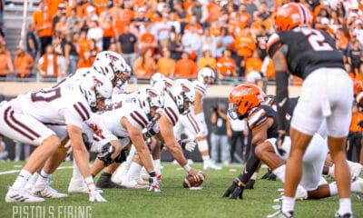
Report: Big 12 ADs Have ‘Serious’ Talks about Not Playing Texas Tech Following Sorsby Ruling

Oklahoma State Has the Big 12’s Best Trio of Offensive Superstars

1945 vs. 1988: What Was the Greatest Year in Oklahoma State Athletics History?

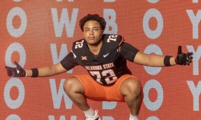
Three-Star Offensive Lineman Chase Clark Commits to Oklahoma State

Oklahoma State Flips Three-Star Offensive Lineman Sonny Mullen from Houston

Daily Bullets (June 9): Sorsby Ruling Fallout

Ruby Meylan Named to OKC Spark Reserve Pool Roster
Report: Big 12 ADs Have ‘Serious’ Talks about Not Playing Texas Tech Following Sorsby Ruling

Sorsby’s Temporary Injunction the Latest Example of How Broken College Athletics Is

Daily Bullets (June 8): Cowboys Land Two Commits, Long-Tenured Coaches Becoming More Rare
-
 Football17 hours ago
Report: Big 12 ADs Have ‘Serious’ Talks about Not Playing Texas Tech Following Sorsby Ruling
-
 Football4 days ago
Oklahoma State Has the Big 12’s Best Trio of Offensive Superstars
-
 #okstate5 days ago
1945 vs. 1988: What Was the Greatest Year in Oklahoma State Athletics History?
-
 Football2 days ago
Three-Star Offensive Lineman Chase Clark Commits to Oklahoma State