
Feature
12 Thoughts on the New Oklahoma State Football Uniforms
Honestly, it’s been too long since I’ve been this excited about something related to Oklahoma State athletics. The last three games of football season didn’t do it. The basketball season certainly hasn’t done it.
Maybe it’s sad (OK, it definitely is), but I was genuinely giddy on Wednesday afternoon as Dez Bryant, Brandon Weeden and Dan Bailey revealed the new Oklahoma State football uniforms for 2016.
We’re doing a podcast about them on Thursday, but I wanted to write down a few leftover thoughts I had on the big reveal.
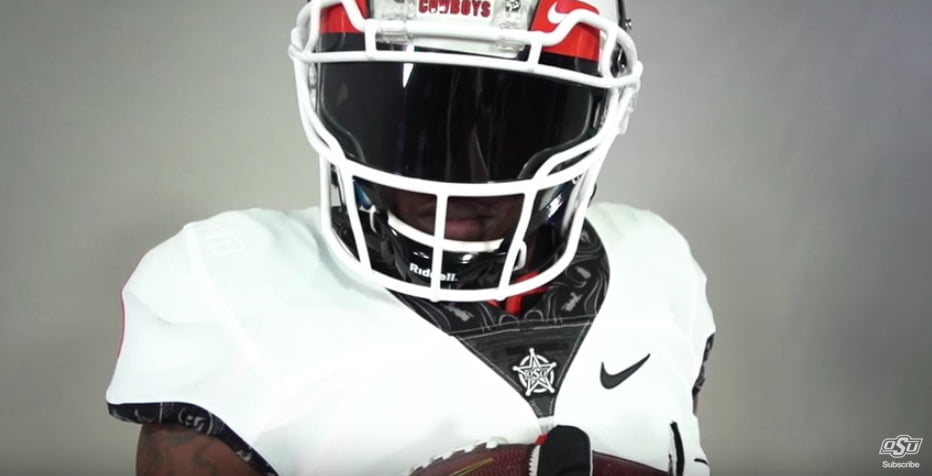
1. No name on the front
One of the biggest complaints I’ve seen so far is how plain these uniforms are on the front. There’s no Oklahoma State, no patches other than the brand on a star on the neck and really nothing except for the number and the Nike logo (and eventually the Big 12 logo).
I get why people don’t love this but I sort of love how clean it is. It’s like mixing Alabama with Oregon and tossing some orange on it. The neck and sleeves are busy enough. You don’t want to go overboard.
2. Brand becomes secondary
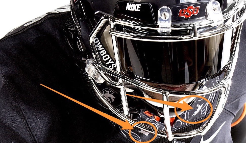
Speaking of the brand. Man, we’re really going away from it, aren’t we? Unless there are a bunch of helmets they didn’t reveal (a possibility for sure) then the main markers the uniforms have on them are Big Chrome Pete, Scary Pete and the word “Cowboys.” Really, the only place you see the brand is on the star down the neck.
Speaking of that star, I think this is a legitimate complaint. Although, I always loved it and I’m glad they’re bringing it out 13 times a year instead of one.
Only thing I don't really like on #OKState unis are stars, just b/c OSU already uses that as a motif for its badass bowl captaincy patches.
— Mike Harris (@TheMikeHarris) March 2, 2016
Here’s what the site says about the star: All uniforms include a marshal badge just above the numbers. The badge is a proud reminder of Frank Eaton, the original Pistol Pete, and his service as a U.S. deputy marshal.
That’s pretty great.
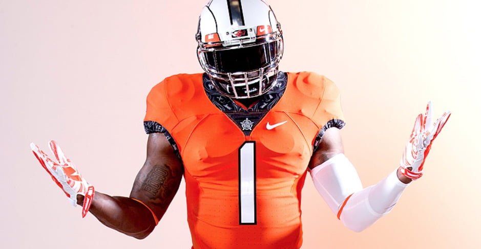
3. The trim is sick
Mrs. Pistols hates the trim. Mrs. Pistols is wrong. I think it’s amazing. I also love the backstory (paddles, Bedlam bell, retired numbers, etc.) that went into it and that literally no other team in the country will be wearing anything like these.
It’s a little like the Nike basketball uniforms that have historic stuff from your individual campus on the back which everybody has now. I think OSU is the first to do this with football.
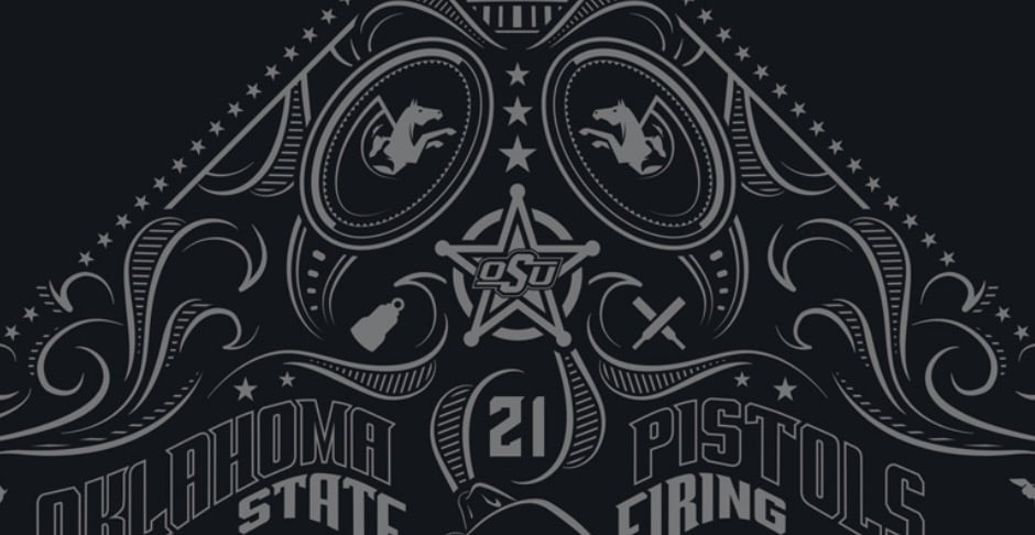
I would like to hear about what each individual symbol means (i.e. the train). Here’s what the OSU site says about the print: Much of the trim art on the neck and sleeves is presented using a custom paisley print inspired by a cowboy’s bandana.
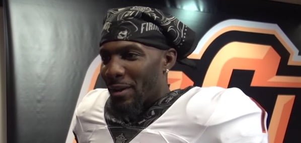
4. Speaking of bandanas
All DBs and WRs need to be wearing these all season. Every game. All colors. Right now.
5. Choo Choo?
And speaking of trains. Was this a shout out to the third most-beloved QB on that 2011 Big 12 title team (Clint Chelf)?
Oh, it’s not. Boooo!
For those that's been asking. The train on the neck is the original "Tombstone" train that we use in our intro video #tellemimcoming
— Rex and The Chief (@RexandTheChief) March 3, 2016
6. What about the helmets?
This is the part where I start to criticize. I’ve had a day(ish) to think about it, and I’m not a huge fan of the helmets OSU seems to be trending towards. The best lids they wore last season either had the OSU brand or a throwback version of it on the sides.
There seems to be a push towards Giant Chrome Pete which is all right, I guess, because it seems to fit with the general theme (more on that in a minute). I just don’t love it on a personal level, and I think there’s a way to incorporate the branded helmet as your go-to still.
Of course, as Chris Knox pointed out, they don’t seem to be going away from it completely. And hopefully they keep pumping out great throwback helmets.
@pistolsguy Here's another shot of the first helmet, just looks like this uni's iteration of the classic brand on w/ pic.twitter.com/wxMloeRBSz
— Chris Knox (@cknoxdesign) March 3, 2016
7. I love the numbers
I mean, I love them. I think about font more than most (and more than I should) because I internet all day. But this is just a great, great look. I actually think the “1” is one of the least good-looking numbers (aside: how weird was it to see Weeden wearing No. 1?)
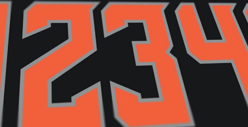
Here’s what OSU said about them: The numbers on the jersey, the word “Cowboys” on the leg and the retired jersey numbers – 21 for Barry Sanders, 34 for Thurman Thomas, 43 for Terry Miller and 55 for Bob Fenimore – are all presented using a new barbed wire typeface that serves as a reminder of the cowboys who drove their herds across Oklahoma across the great Chisholm Trail.
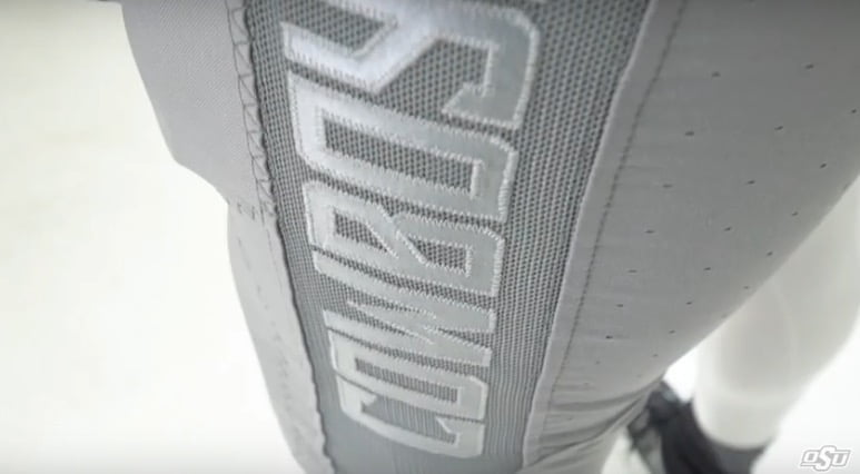
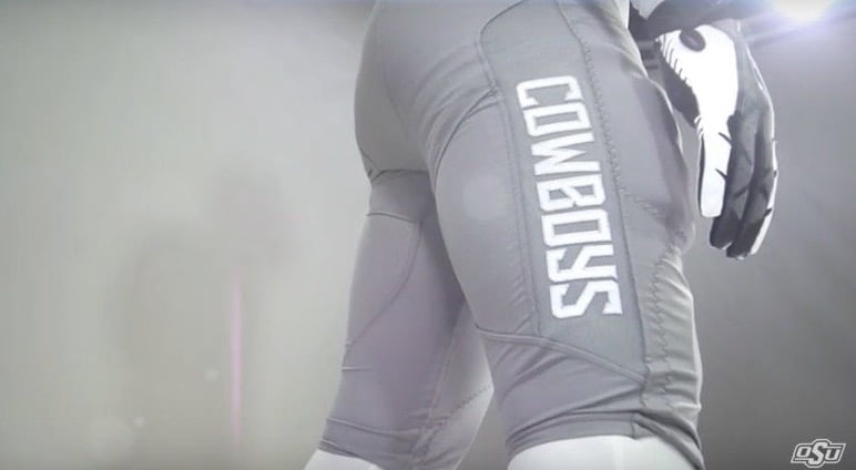
8. Cowboys down the leg
Somebody on Twitter said this was something Adidas would do. I disagree. This is something Adidas would screw up. I’m a fan of the gray pants and a fan of the Cowboys running down the side. Come at me!
Something Adidas would do? They wish. pic.twitter.com/TBc8UM262i
— Southwell (@JustinSouthwell) March 3, 2016
9. The blend is good
OSU has set itself up nicely with these threads. Here’s a question: which part of your uniform is the easiest to change throughout the season? The helmet, right? That’s the piece they’ve changed most over the last few years.
By removing the name from the front, adding the trim on the sleeves and neck and going with the new font, you’ve created a situation where either you could wear crazy paisley helmets that my kids would dream up or simple throwbacks and either would look good. That’s more difficult to do than you would think.
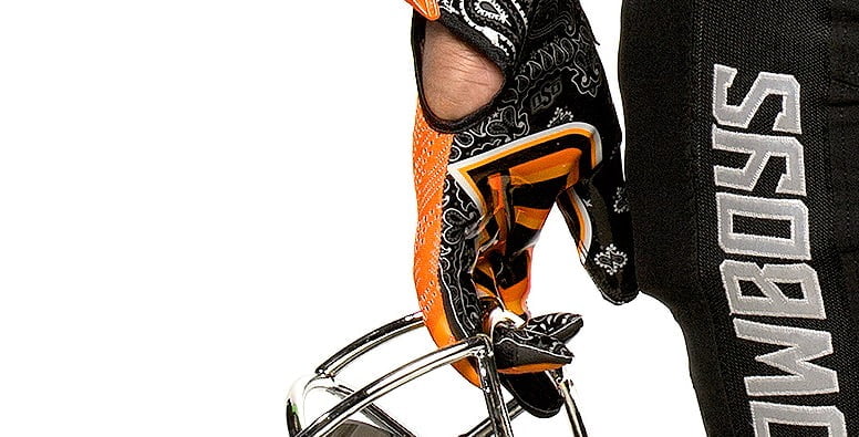
10. Those gloves
I couldn’t wear them (nor should I), but recruits will love them.
11. The timing was interesting
An early March Wednesday afternoon at 4:30 for the biggest news of the offseason? That was a little odd. And with little to no buildup. I get that you probably had to plan around Dez and Weeden’s schedules, but I was perplexed by the seeming randomness of the whole thing.
Also, this is brilliant.
Maybe next time OSU should have the reveal just before Signing Day. Just a thought… https://t.co/k9wnmDl7L4
— Matt Amilian (@mattamilian) March 3, 2016
12. Old meets new
As cool as the new uniforms are, the best part was Dez, Weeden and Dan being there for the reveal. Weeden hitting the Dab was spectacular. Dez, as my buddy Quade pointed out, was far more hyped than any of the players. And Dan was about as fired up as you’d expect (and want) your kicker to be.
When @DezBryant, @bweeden3 and Dan Bailey help you unveil your new uniforms to the team. #okstatehttps://t.co/lg69agZtOj
— Cowboy Football (@CowboyFB) March 2, 2016
If you watch the video of them on stage, Dez is doing crazy Dez stuff and dancing like a maniac, Weeden is doing the Superman and screaming into the crowd. And there’s Dan slowly taking his helmet off like he just pumped another 53-yard power fade between the posts. Kickers, man.
I say that in jest, but I also think it’s really great that those dudes agreed to come back and take part in this. Mike Gundy seems to have done a good job of creating a culture that supports itself with or without his existence which is a tremendous compliment to the work he’s put in.
Behind the scenes: it took zero convincing to get Dez, Brandon and Dan back to #okstate for uni launch. All 3 loved concept from the start.
— Gavin Lang (@glang1) March 3, 2016
The threads are awesome, but the way they were revealed says even more about the program.
Also, we have come a looooooong way.
https://twitter.com/NatePetersonOSU/status/705169242040041472


Format for Oklahoma State’s Spring Game Announced

‘I Never Questioned God’s Plan’: How Christian Bodnar Battled Through a Brain Infection That Threatened His Football Future

Position Coaches Give Updates on In-State Freshmen KD Jones and Braeden Presley

How ‘Super Electric’ Tre Page Made the Jump from FCS to Become a Cowboy

Sam Houston Transfer Guard Jacob Walker Commits to Oklahoma State

Oklahoma State Adds Transfer Portal’s Top Player in Audi Crooks

OSU Baseball: Cowboys Drop Series Finale to Kansas 9-6

OSU Softball: Cowgirls Beat Arizona 7-5 to Clinch Big 12 Series

Daily Bullets (April 19): OSU Spring Games Gives Fans First Glimpse of New-Look Pokes

OSU Baseball: Cowboys Split Games 1 and 2 with Kansas
-
 Football4 days ago
Format for Oklahoma State’s Spring Game Announced
-
 Football5 days ago
‘I Never Questioned God’s Plan’: How Christian Bodnar Battled Through a Brain Infection That Threatened His Football Future
-
 Football4 days ago
Position Coaches Give Updates on In-State Freshmen KD Jones and Braeden Presley
-
 Football5 days ago
How ‘Super Electric’ Tre Page Made the Jump from FCS to Become a Cowboy